ENGINEERED FLOORS / PRINT ADVERTISING + SELECTED SOCIAL
Making flooring worth a second look.
Flooring is part of everyday life: the spill that interrupts dinner, the room a pet makes its own, the colors that give a space its character. In my advertising work for Engineered Floors, I used those connections to give product benefits a clear idea and a distinctive headline.
“Common ground for sworn enemies” turns the floor into shared territory for a dog and a robot vacuum. The overhead composition gives the headline a simple visual setup.

COMPANY / Engineered Floors, in-house
PERIOD / 2025–2026
BRANDS / PureGrain, DreamWeaver, Pentz
ROLE / Concept development, headline writing, visual direction, layout, and final artwork production
01 / EVERYDAY MOMENTS
Finding the idea in everyday life
A spilled egg and an escaping bath-time dog turn performance benefits into recognizable moments. “Whoopsie-proof” and “Bathtime fugitive proof” let the scene carry the setup and the headline deliver the payoff. Other executions use the same everyday familiarity to talk about comfort and softness.


A small edit from “your” to “his” lets the dog claim the bedroom—and gives the headline its personality.

A trio of plush toys becomes a “softness committee,” giving the carpet message an unexpected set of experts.

02 / VISUAL METAPHOR
Making realism feel unexpected
For PureGrain High-Def, an impossible wood triangle gave the realism message a visual metaphor. The isolated form and orange background focus attention on the wood texture and the illusion. The headline connects a realistic finish with a seemingly impossible object.
03 / RESIDENTIAL STYLE
Giving the floor a role in the room
“The balance to your bold” positions quiet carpet against expressive wallpaper. The room’s contrast becomes the concept, and the headline explains the floor’s role. Other ads explore that relationship through color, texture, and personal style.


“In our blue period” connects carpet to the room’s color story. “The art of layering and accessorizing” links the layered floor treatments to the clothing and accessories in the scene.
04 / PRODUCT CHOICE
Bringing the range into one composition
“Top of class, across every style” brings three interiors and carpet families together through vertical slices. The repeated composition makes room for variation while keeping the product range connected.


“Room to Choose” uses a divided interior to bring carpet and hard-surface flooring into one message. The lower panel carries product information and display imagery while the headline connects the two sides.
05 / COMMERCIAL COLOR
Connecting color with identity
For Pentz, “Now, even your floors can be on brand” gives the color range a bold typographic treatment. The Reverb ad takes a more restrained approach: yellow accents in the room, flooring, and headline reinforce the idea of a strategic pop of color.


06 / NATURE MESSAGING
Giving the nature story a visual language
“Green is in” connects a mint-colored kitchen with PureGrain Renew’s nature messaging. Leaves and wood samples make that connection more literal in “Rooted in nature. Renewed for life.” The creative-studio execution brings the message into an inhabited space, with product displays and supporting details completing the layouts.


07 / DOMESTIC MANUFACTURING
Giving a direct message some personality
For the Made in the USA ad, oversized typography carries the message while a dog in a flag bandana gives it a familiar, domestic setting. The overlap between the dog and the letters connects the statement to the scene.

08 / SELECTED SOCIAL
Carrying the ideas into social
The selected social pieces use concise headlines and a clear visual idea. Tree rings, a forest setting, and a tree made from flooring planks give the products different contexts while keeping the material at the center of each composition.
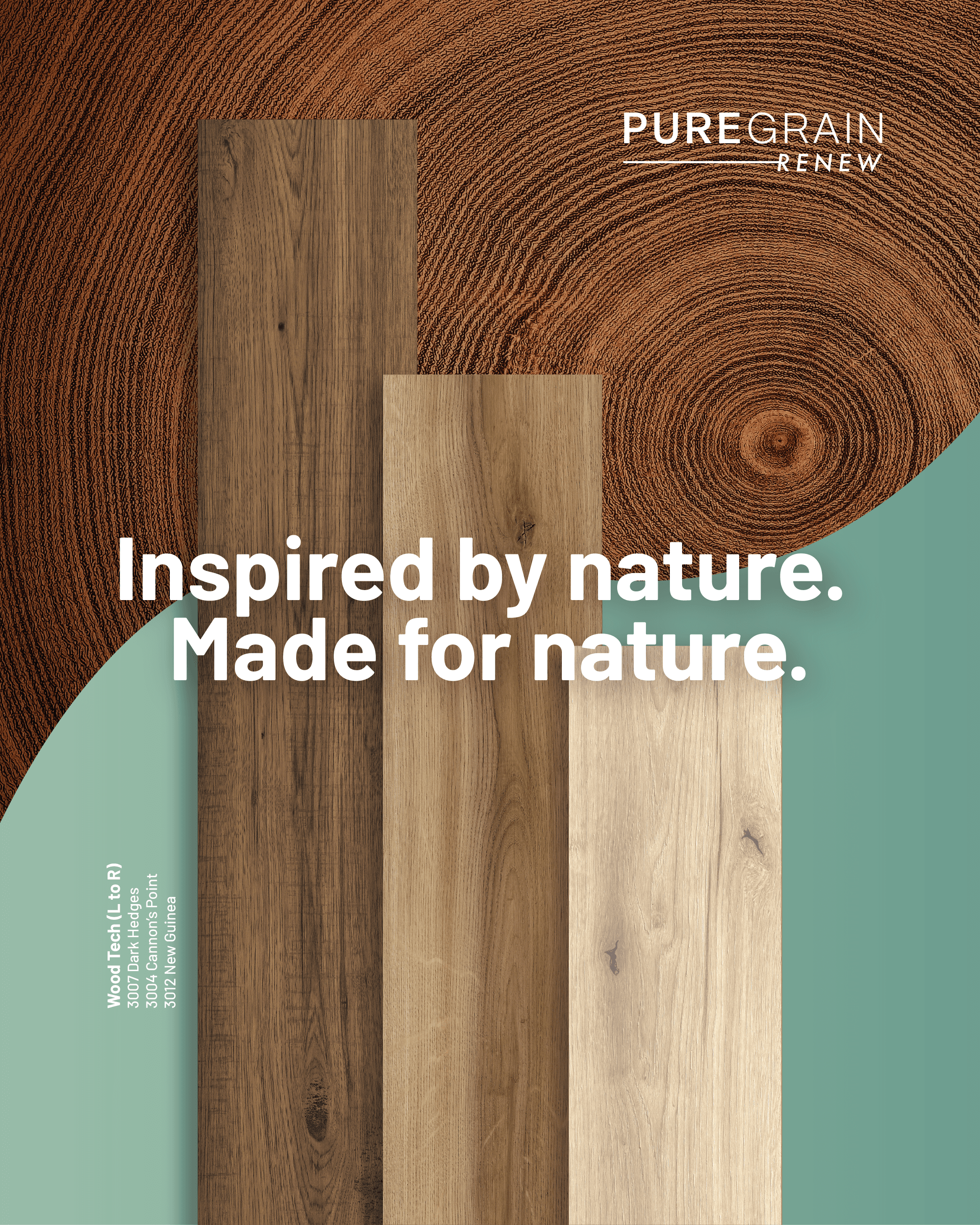
Inspired by nature — Tree rings and flooring planks connect the product’s appearance to its source of inspiration.

Right where it belongs — A product display placed in a forest turns the setting into the message.

Deck the halls — Stacked flooring planks become a seasonal symbol.
FROM CONCEPT TO FINISHED ARTWORK
From concept to finished artwork
Across the Engineered Floors portfolio, I developed concepts, wrote headlines, and carried layouts through final artwork production. Each execution brings together a central idea, its product details, and the needs of the format. The selection shows that approach across residential and commercial brands, with related work for social.
CREDITS / Room scenes and product renderings were produced by external partners. Product rendering and image retouching/coloring were outside my contribution. My contribution to photography direction was supporting.